Art I
"I dream my painting, and then I paint my dream." -Vincent Van Gogh
|
12/16/2016 0 Comments Impact Comic StripI created this comic strip to show the impact other's words can have on people. In the comic, my character is overhearing things people are saying about her and it affects her self image negatively. Then the comic shows how positive words can also impact people. In the end the character realizes that other's words, whether they are positive or negative, do not define who she is as a person and she finds a way to love herself despite what others may think. 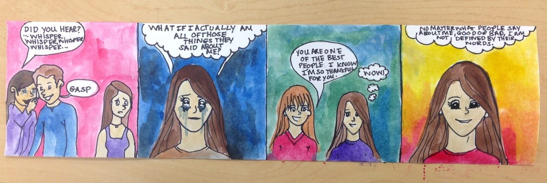
0 Comments
12/16/2016 0 Comments Text Image ProgressThis is the progress of my Text Image. I need to finish writing the negaitive words around the word "Beautiful" before going over it with a lightl layer of red watercolors, and then creating the blood drips and the background. 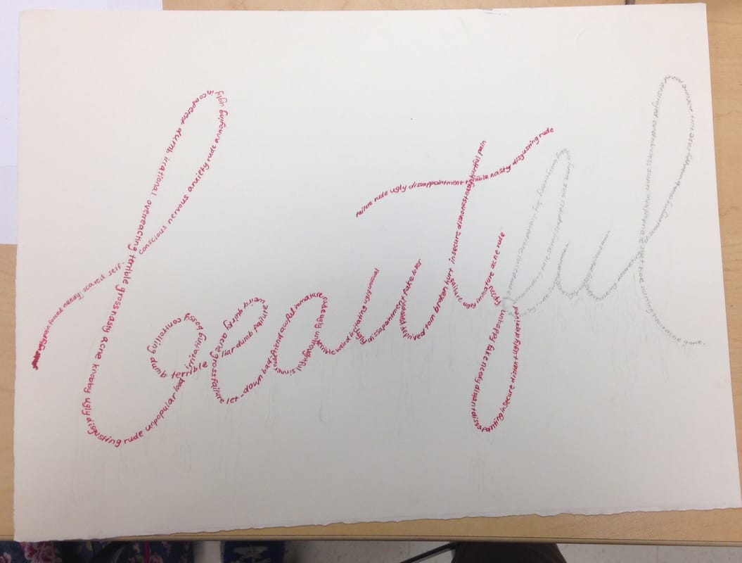 12/12/2016 0 Comments Art Critique PaperLydia Gunn December, 2016 Art 1 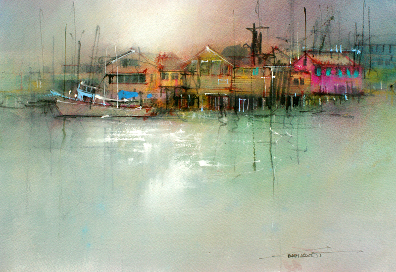 This Representational art piece, an Australian watercolor, was painted by the artist John Lovett. Lovett was born in Crooma, N.S.W. Australia, and lived with his two brothers and his father, who was the official artist for the Snowy Mountains Authority and always encouraged Lovett to draw and paint. John spent his childhood growing up to have a deep love and respect for beauty, nature, exploration, and the Australian terrain. When he graduated school, he attended the National Art School in Newcastle. Following art school, he got married and moved to Sydney, where he began a job that he quickly became discontent with. He knew that all he really wanted to do with his life was create art, so he set out to make his name known in the art world. His passion for his work and for the world around him is displayed in the delicate details and color of this paintings, especially this one.
This piece reminds me of one of those rainy days that makes you just want to curl up in bed and watch the clouds out the window while you stay warm and dry. The whole thing makes me think of a small town or harbor inhabited by homely people who live in peaceful contentment and care for one another within the parameters of their small home. I wonder about what might go on in the lives of those who live at that tiny harbor, and if any one person there ever gets tired of the calm isolation the place seems to have from the rest of the busy, raging world. I can imagine children spending their days studying, meandering by the fishing docks, and doing chores for fishermen to earn a few dollars. When I look at this piece I can hear the soft call of seagulls, and the rolling waves lapping gently at docksides like salty tongues while misty clouds set in above. I can hear the soft tolling of a school bell somewhere in the distance and smell the ocean in the air while fishermen drag in their nets of fish and anchor their boats at the end of the day. This piece seems to have a certain, quiet gloom hanging over it, small sections of bright color illuminating the buildings through the mist. There is a fishing boat resting in the water in front of the houses and the shadowy fishing docks, and there are bright highlights decorating it, just as on the buildings. Although some of the windows in the houses seem dark, others, the pink house to the far right in particular, have windows that are brightened with a cyan tint. The edges of the yellow buildings on the left are outlined with red and there are deep shadows lurking beneath the docks. The water seems to be slightly murky, a turquoise color dancing on the top while the reflections of boats, fishing poles, masts, and the buildings ripple across it. The sky is overcast and bluish gray, a touch of pink and orange accenting the weak glow of sunshine filtering through the clouds and reflecting on the water below. The artist really achieved the use of the Elements of Art and the Principles of Art in this piece. He used the element of Line in the fishing poles and masts, the element of Shape in the rectangular buildings hovering over the water, Value in the shadows under the dock, in windows, and around the edges of the roofs, and the elements of Texture and Color to accent the structures of the buildings by the docks. The Principle of Variety was used in the contrast of the colorful buildings and dull surroundings, and the Principle of Unity was used in the blending of the elements and principles of art in the composition. Considering all of these factors, I think that this piece was created with watercolors, but not using an excessive amount of water. This is because the colors look very controlled and smooth and it’s more the lines and highlights in the water and on the buildings that show texture and movement. The focal point of this piece is the tiny harbor probably nestled at the corner of a small town near the waterside, the colorful highlights on the buildings hinting at their importance. I think that the artist wanted us to focus on this peaceful place and take a deeper look at what life might be like there. Perhaps it is a fictional place, or maybe it is a real location that means something special to him, which influenced him to create this painting. Maybe he was attempting to express an emotion more than a physical place. To me this painting symbolizes a calm, pensive gloom that all of us experience at some point in our lives, reflecting on who we are, our purposes, and our “colors”, which are represented by the bright buildings in the center of the piece. It takes time to figure out who you are as a person, which may be why most of the painting and even some of the houses are dull or not as accentuation as other parts of the piece. This could represent how we slowly discover our personalities, our hopes, and our dreams. If we can break away from a society that often sets certain standards for people and makes them feel inadequate if they do not meet those “expectations”, our lives will be more satisfying when we are free to be who we are and love others for who they are. The artist may have chosen this subject matter to subtly imply these underlying meanings, ideas only discovered by those who take the time to really examine the piece and all that it could possibly mean. In my research of this painting, I could not find its title, but If I could give it one, it would be “Peace Found in the Mist”. After studying this piece, I think that the artist used excellent craftsmanship and is clearly very skillful at using this medium to create art. The whole painting is brilliant; simple, but seemingly full of meaning. Not only is it calming and satisfying to look at, but because of its unclear intentions, it allows the viewer to draw his own conclusions about the significance of any underlying message in the piece. While some may only see a simple, gloomy little harbor with a fishing boat near the docks, I see the colorful, isolated buildings representing us and the journey of discovering who we really are despite the clouds and the gloom slowing us down. Any one person may draw a different meaning from it, and I think that is the beauty of this painting. To me, this watercolor was definitely worth examining, especially focusing on the detail and color. It taught me that art can have a huge impact on people and any one piece can mean something totally different depending on who is viewing it. It is so inspiring to me that artwork can affect someone in a way that the artist didn’t even intend! This is why I love art, because it is so thrilling to be able to express yourself in a deeply personal way and watch as the world reacts to it in a thousand different ways. 12/9/2016 0 Comments Text Art Progress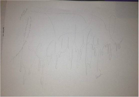 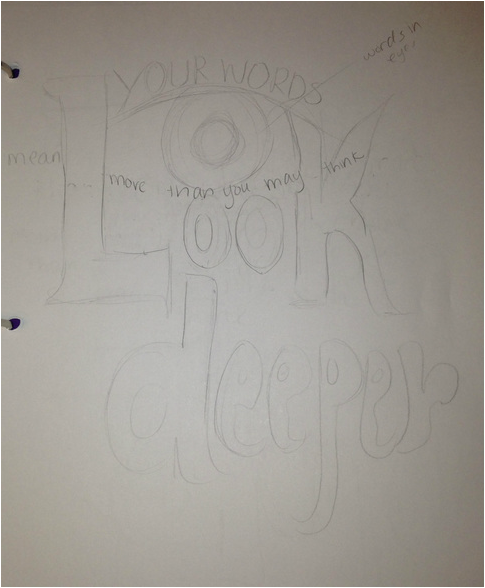 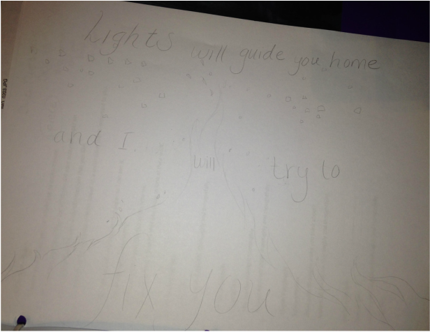 Next we are doing a project creating art with text. I'm still thinking of ideas, but here are some of my thoughts for a design.
12/9/2016 1 Comment Finished Collage and Pop Art pieces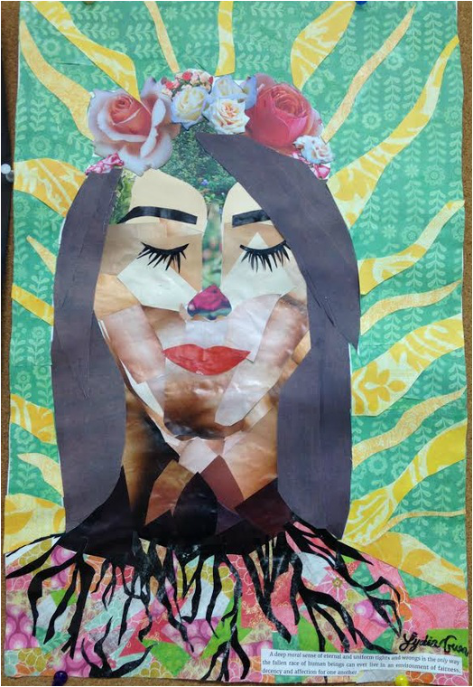 This is my finished Collage Self Portrait. At first it started out as just representing myself, and then I realized that its meaning could relate to all people. This piece represents the beauty that is inside all of us. The flowers at the top represent the people we all are and the ideas, dreams and hopes we have. As you look further down into each person things start to get darker, and there are things in our society rooting us down and restraining us from being ourselves. The yellow rays represent sunshine, and the light we can give off if we can break free from society's standards. 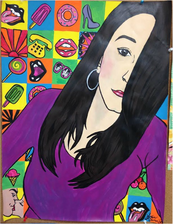 This piece kind of seems to represent pleasure with bright colors and pop art icons. Pleasure may be temporary but we should still enjoy it and live life to the fullest. I am really satisfied with how the colors turned out and worked together, and I think the background is my favorite part. I think I could have done a little better job with the skin color and blending, but it turned out.
12/2/2016 0 Comments Collage Portrait ProgressThis is the progress I have made on my collage piece. I used printed paper for the background and section behind the roots, and pieces from magazines for everything else. I think I am lmost done, but I might do more details with the hair and the background.  12/2/2016 0 Comments Pop Art ProgressThis is my progress on my popart piece. I have finished the background, besides going back and redoing some of the outlines, and started on the dress. Next I need to mix a skin color and a hair color.  |
