|
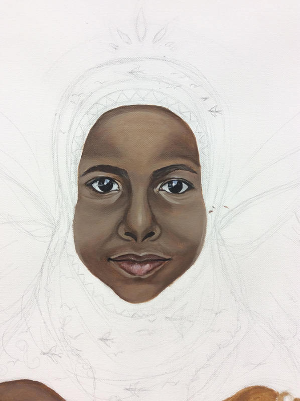
1/3/2018 0 Comments Finished Final Project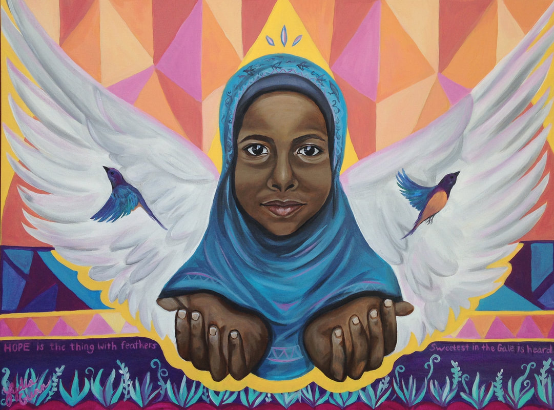 This is the finished product of my final piece. Over Christmas break, I was able to paint the plants growing at the bottom. These symbolize the growth the refugees have to experience as they are uprooted and planted in unfamiliar soil. Then I added the finishing touches and decided the piece was complete. I was slightly frustrated because originally, my plan was to paint words and symbols in the triangles in the background. But when I started, I realized that the words caused the piece to look far too cluttered. Since the painting is not actually as large as a mural, the added words were just too much. I was a little bummed about this, since I had been hoping to add a lot more to it. Instead, I ended up adding a phrase of Emily Dickinson's poem "Hope is the Thing with Feathers" near the bottom of the piece. In the end, I think the simplified version looks a lot cleaner and more complete. I also painted the triangles directly above and behind the refugee using yellow, which helped balanced the yellow in the bottom. In the triangle above her head are three small paisleys, which could represent either a crown or the Trinity- God the Son, God the Father, and God the Holy Spirit guiding her and watching over her. One thing I would have changed about the piece is to center the subject a little more, since she is over to the right a little too much. This causes the patterns behind her to be slightly uneven, more of the pattern showing on the left side. My main technique throughout the piece was to add water to the acrylic paint in order to blend it more easily. This is how I was able to blend the skin tones on the face so accurately, and I realized through this piece how important it is to find my own technique of how to effectively manipulate certain mediums. However, wish I would have explored a few different mediums with this piece, especially because I am already very familiar with acrylics. It would have been a good experience for me to try and incorporate some spray paint, like Joel Bergner does. Overall, the whole piece is meant to convey the message of hope. Even in the darkest storm, the little bird called Hope does not stop singing. I am incredibly inspired by the work done by Joel Bergner and through this project I have realized that I want to use my art for something that meaningful. His desire to add color and healing to the lives of the refugees is incredible, and after learning about his mission I only found myself feeling more passionate about the subject. This piece is deeply personal to me, and as I look at the girl in the painting with outstretched hands, it seems that she could be either giving or receiving something. I am reminded that while I gave much to the refugees during my missions trip, they also gave to me. Through them, I saw incredible joy and hope despite bleak circumstances. I learned how to show love to people who need it, and my eyes were opened to the different cultures, beliefs, and people in this world. It was beautiful because I realized that the material things of this world will never satisfy, but it is people who will truly matter in the end. This world will pass away, but they will not, and my desire is to spend my time in this life showing people the love of Jesus.
0 Comments
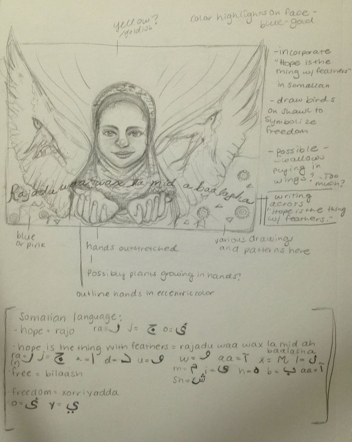
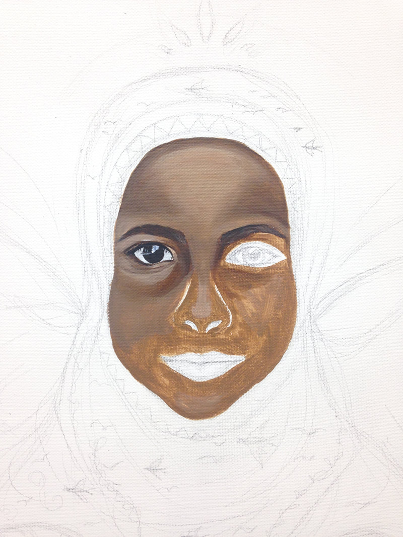
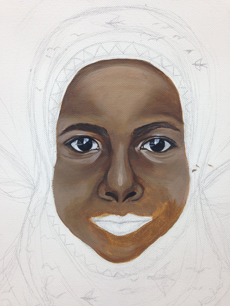
12/21/2017 0 Comments Final Project ProgressThis week in class I simply focused on painting the wings and the background of my final project. I was able to complete the head covering and face of the refugee, Aamiina, over the weekend, allowing me to focus on the rest of the piece in class. First, I began with the wings. I wanted to make them stand out somehow, so after doing a white base layer and adding depth with shadows, I highlighted some of the feathers with a light pink color. At first I wasn't sure if I liked how it looked, but once I began adding color to the background I was pleased with how everything balanced out. My plan is to fill the background with different colored triangles and other shapes, and then go back and fill them in with Somalian symbols and words from the poem "Hope is the Thing with Feathers" by Emily Dickinson. The entire piece is meant to symbolize hope, and I plan to incorporate that into the background. I was also able to paint the birds in the wings, turning them into Golden Breasted Starlings from Somalia. I am pleased with how the colors of the birds fit so perfectly with the overall color scheme of the piece. In the middle of the painting, I added a strip of a darker colored pattern to continue incorporating the darker tones within the piece. Below that, I began filling in the bottom section with a dark purple color, and I plan to add teal into the designs along the bottom, as well as other patterns in the purple. Once I finished that, I realized that I needed to incorporate more of the yellow in the top section of the painting. So, I filled in th the triangular column behind Aamiina's head using the same yellow that is outlining her hands. I think this helped to balance it out and add emphasis to the subject of the painting. Overall, I am pleased with how this project is turning out, and I am looking forward to my next steps! 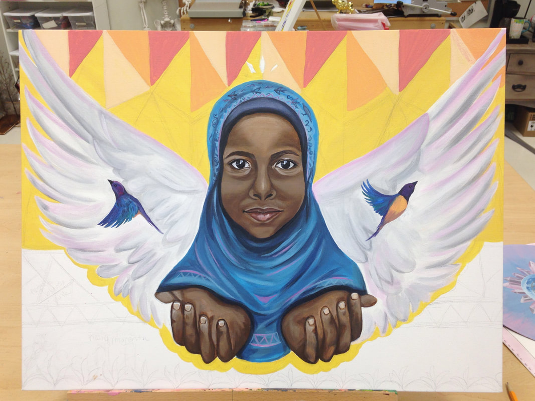 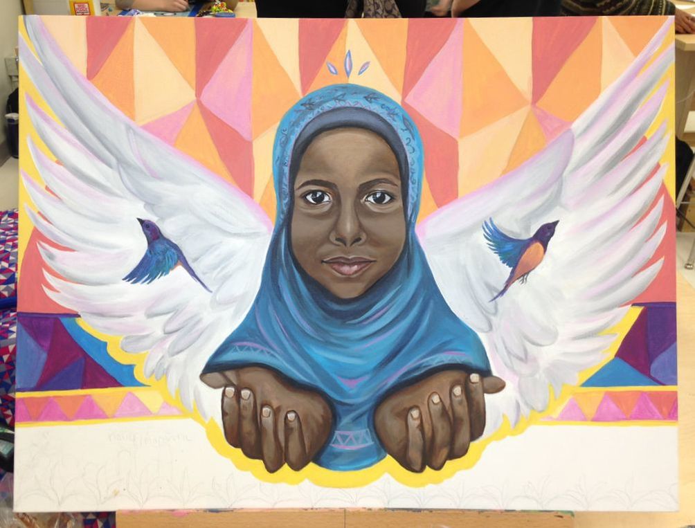 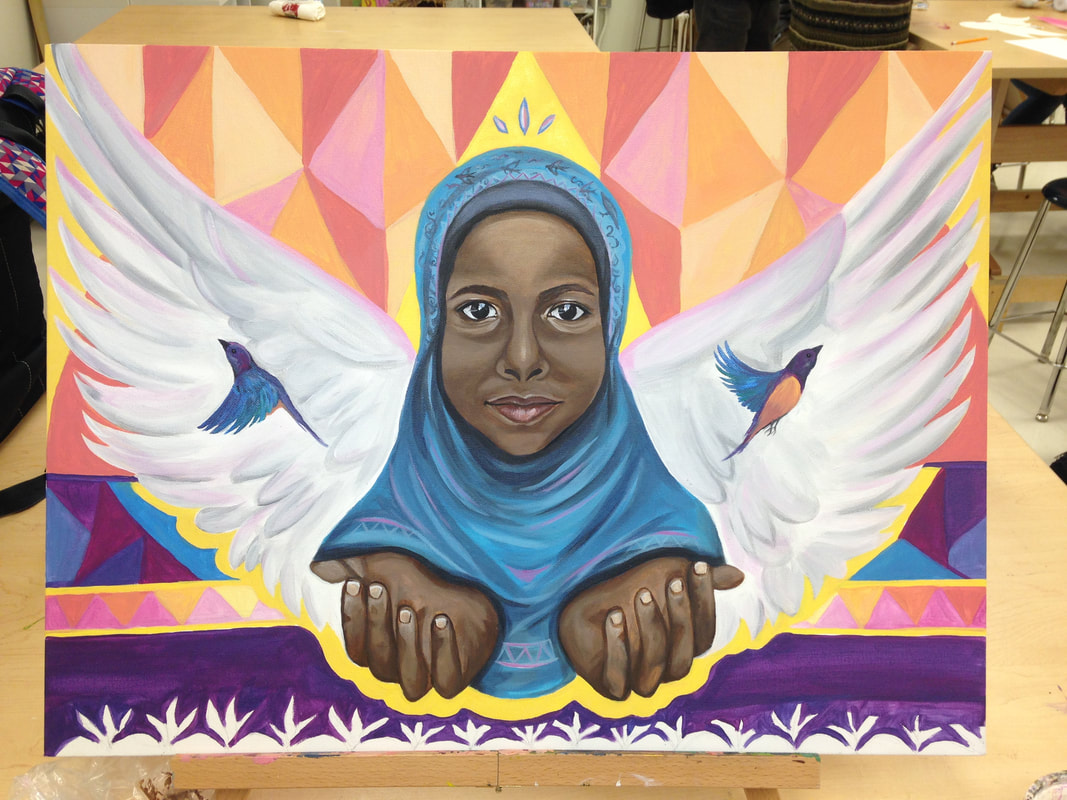 12/15/2017 0 Comments FInal Project ProgressThis week, classtime was dedicated to working on final projects. My project is based on work done by Joel Artista, a mural artist who travels to refugee camps and works with the people there to create something beautiful in the midst of a drab location. On Monday, I started my sketch onto an 18x24 canvas. Previously, I had sketched out ideas in my sketch book, so I already knew the overall direction of my piece. Once I finished sketching everything out, I dove right into the painting. Using acrylic paint and my reference photo of the refugee I am painting, I worked on getting the skin tone and details right. We worked for five days in class, and I have only gotten as far as the face. Overall, I am very excited with how this piece is turning out so far and I can't wait to see the end result.
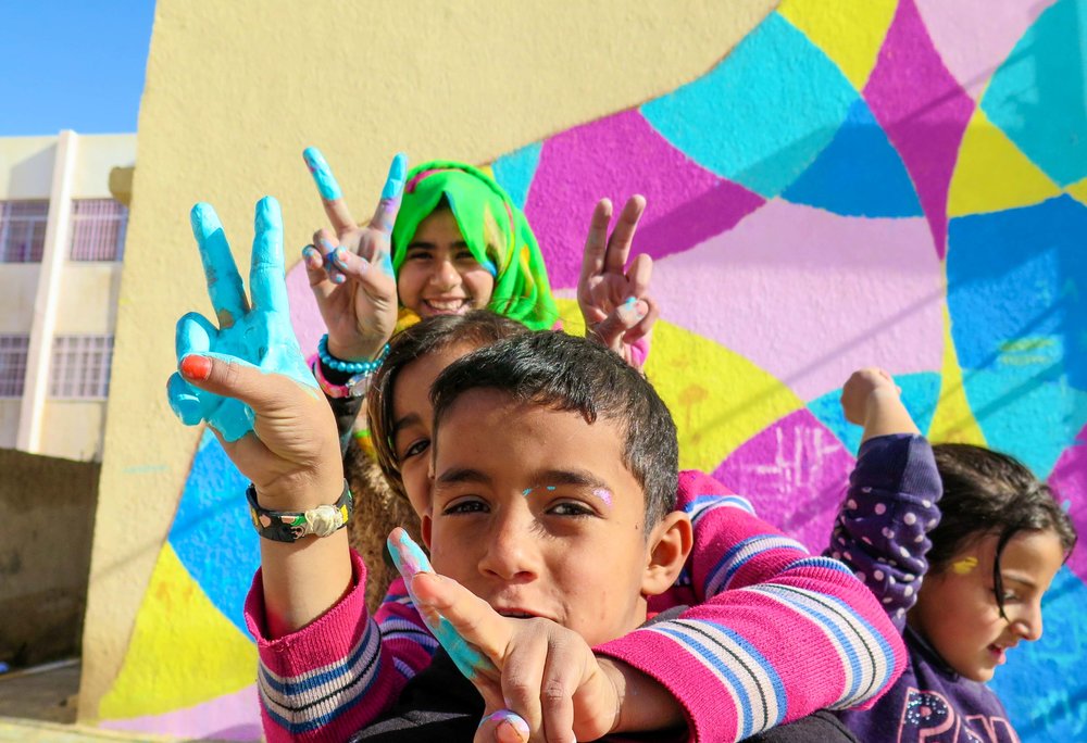
12/7/2017 0 Comments FInal Project Proposal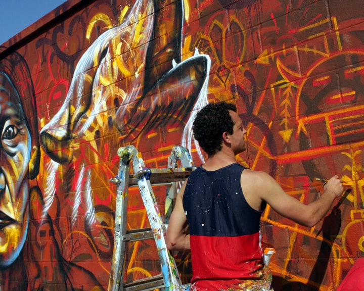 The artist I will be using as inspiration for my final project is named Joel Bergner (aka Joel Artista). Joel is an artist, an educator, and an organizer of community public art initiatives with youth and families around the world. Growing up in Bloomington, Illinois, Joel had a strong passion for art even at a young age. As a descendant of Jewish refugees who endured serious ethnic-based persecution, Joel was instilled with compassion for suffering peoples early on in his life. As a teenager, Joel experienced some difficult years during which he became a teen father. Although the relationship with his son's mother did not work out, he has striven to maintain a relationship with his son and be a present figure in his life. His challenges during his teenage years and during his young fatherhood have greatly impacted his community work with youth, allowing him to empathize with their struggles and help give them hope for their future. For some time, Joel lived in Chicago in the Mexican-American culture, which greatly impacted his calling as an artist. For awhile, he spent time creating his own personal art and dabbling in graffiti, and then he finally was able to paint his first public mural at a cafe. After that, he pursued his passion and has been travelling around the world creating public murals, teaching art and English, and doing educational public art projects with youth through a local church in Rio de Janeiro. He earned his BA in Sociology from the University of Illinois Chicago and has taught in juvenile detention centers, worked with troubled youth and refugees, and has counseled the mentally ill and the disabled. He has also led community mural projects in India, Israel and Palestine, Brazil, Kenya, South Africa, Poland, Sweden, Mozambique, El Salvador, the UK, Mexico, Cape Verde, Peru, Belgium, Germany, the Za’atari Syrian refugee camp in Jordan, and has participated in three international art festivals in Cuba. 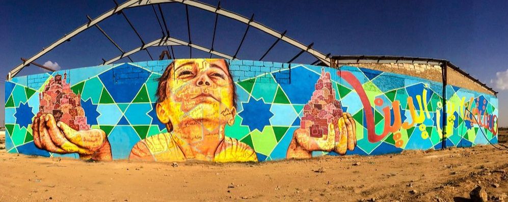 I am choosing this artist as my inspiration for my final project because I want to continue advocating for refugees through my work, but I also want to branch out and try new styles of work. Joel's work is intriguing, and his style is something that I have never tried before. I want to challenge myself and explore a new artist. However, although Joel's artwork is incredible, it is the purpose behind his work that truly excites me. The plight of refugees fleeing their countries has been on my heart a lot recently, and as I have learned about the work Joel does in refugee camps is incredible to me. In his work with the refugees in the Za’atari Syrian refugee camp in Jordan, he has added color to those drab camps by creating large murals. These murals are oftentimes bright and eccentric, and he allows the refugees within the camp to participate in the painting. So, each mural is personalized by the refugees. Essentially, Joel is doing art therapy with them, providing them with a way to cope with the struggles they are facing. It gives the people some source of joy and hope, enjoying the simple act of creating something that will allow them to better understand themselves and better handle their current situation. Joel's work and his position as an advocate for displaced people around the world is inspiring to me, and my dream is to have an impact on the world just like him, creating artwork while helping people to find true hope and direction for their futures. 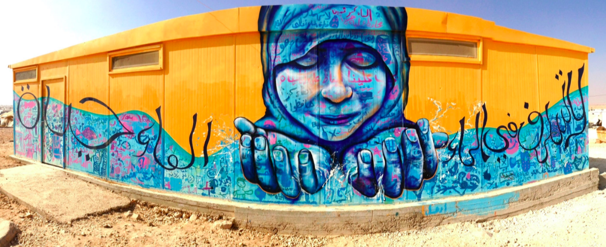 For my project, I hope to use the same medium that Joel Bergner works with. He most commonly uses acrylic paint and aerosol, which is spray paint. I will probably mainly be working with acrylic, adding parts of it in spray paint for overall effect. For the size of my painting, I obviously cannot do a mural of the size and parameter that Joel uses. However, I would like to do my piece rather large. I plan on using a canvas around the size 18x24, give or take. This will give me room to to create a rather large portrait and add the elements of the piece that I hope to include. Overall, I am very excited to start this project. My vision is to use an image of a refugee from Somolia that I met on a missions trip this summer. For her safety, I have changed her name to "Aamiina," which means "feel safe" in Somalian. Her face will be the focus of the piece, and she will have her hands held out as if she is receiving love. Behind her will be outstretched beautiful wings. This idea is based on a poem written by Emily Dickinson titled, "Hope is the Thing with Feathers." It personifies hope as a bird, singing in even the darkest of times. These wings will represent the hope that Aamiina and all refugees can have, expressed through art and vibrant color. Throughout my piece, my goal will be to emulate Joel Bergner's style, yet putting my own personal touch on it. I believe that through art, hope shines through, and that is my goal through this project.
Photos from https://www.artolution.org/global-refugee-crisis
12/7/2017 0 Comments Finished Band Design Project
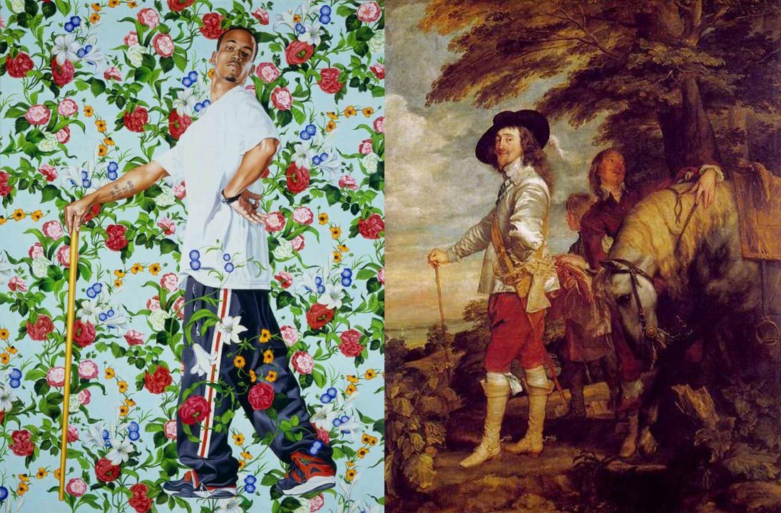 It is vitally important to spend time comparing and contrasting work done by different artists in order to better understand the meaning and the historical context behind the pieces. This understanding is imperative because many modern artists have based their artwork off of the work done by artists of the past. A classic example of this can be seen in Kehinde Wiley's work, which mirrors, yet redefines, works done by historical figures such as Phillip II, Anthony van Dyck, and Napoleon I. Born in South Central Los Angeles in 1977, Kehinde first attended art school at age 11. In LA, he was involved in the environment that was driven by hip-hop culture: violence, anger, and anti-social behavior. His mother worked hard to get him and his siblings out of the hood. He would attend art school on the weekends, and there he most enjoyed trying to make one piece of art look like something completely different. This made him feel important and allowed him to think outside the box. Sometimes he would start with drawings of shadowed fruit, and then he would turn it into a human head and add the body. As an undergrad at the San Francisco Art Institute, he really focused on learning how to become a masterful painter, grasping all the aspects of the skill. And then at Yale University, he became much more focused on bringing out social issues like identity, sexuality and gender, politics, and other topics in his paintings, which is why his work is so important to art history. He currently lives in Brooklyn, New York, and focuses on painting everyday African-American men and women, celebrating their culture through them. He once said, "I think there's something important in going against the grain, and perhaps finding value in things that necessarily institutionally recognized." One of the artists Kehinde mimics in his art is Anthony van Dyck. Sir Anthony van Dyck was a Flemish Baroque artist who became the leading court painter in England. He was born on March 22, 1599 in Antwerp, Belgium. When he was ten years old, his father sent him off to be trained by the painter Hendrik Van Balen. In 1615, after about seven years at the workshop, Anthony Van Dyck was able to set up his own workshop and take on an apprentice. Van Dyck also worked as an assistant painter with Peter Paul Rubens and was accepted into the Lucas Guild of painters in 1618. His work was important during many different time periods including Baroque, Antwerp school, the Dutch Golden Age, the Northern Renaissance, Mannerism, and Realism. He was best known for painting portraits of European aristocracy, but he also explored religious and mythological ideas and was very skilled at drafting and etching. One of his most famous paintings is titled Charles I at the Hunt, which Kehinde Wiley mimics in his piece titled La Roi a la Chasse. 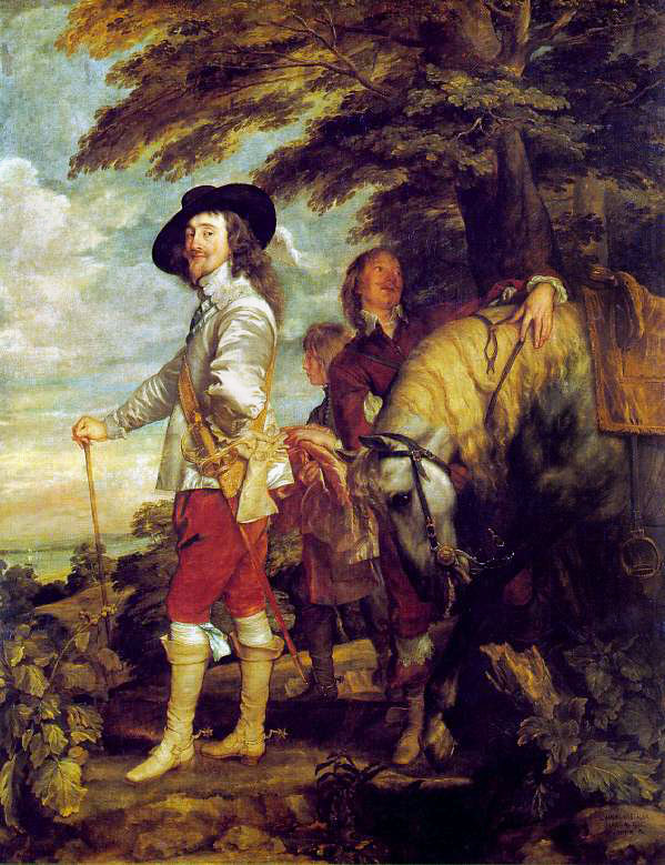 The first art piece to examine is Charles I at the Hunt by Anthony Van Dyke. This piece was created with oil paints on canvas, painted in 1635. It was painted in the Baroque art movement, and the subject of the piece is King Charles I of England on one of his countryside hunts. Van Dyck painted the King standing casually, one leg extended while one arm rests on his hip and the other on his cane or walking stick. He appears to be almost nonchalant, an amused smirk playing on his face. He is dressed in fancy attire, including boots and red pants, along with a silky shirt and gloves. He has a sword fastened to his hip and a large black hat sitting crookedly on his head. His hair is long and his lip is decorated with a shaggy mustache. His complexion is almost unnaturally pale, and he is not looking directly at the camera. While it is clear that he is royalty, he appears to be slender and pale almost to an unhealthy extent. Behind him is his horse, who looks entirely fit to be royal. The neck of the dappled grey creature is decorated with a golden mane, bending its head down as a possible sign of exertion. There are two men behind Charles I, one of them tending to the horse and the other appearing to be carrying coats or some other objects of clothing. The scenery around the men appears to be a small clearing just at the edge of the forest, overlooking the ocean. The whole piece seems to have a yellowish tint to it, many of the tones darker and more shadowy. Overall, the richness and beauty of Van Dyck's work is what has earned its reputation, and as artists we are able to learn much from his technique and style of portraiture. 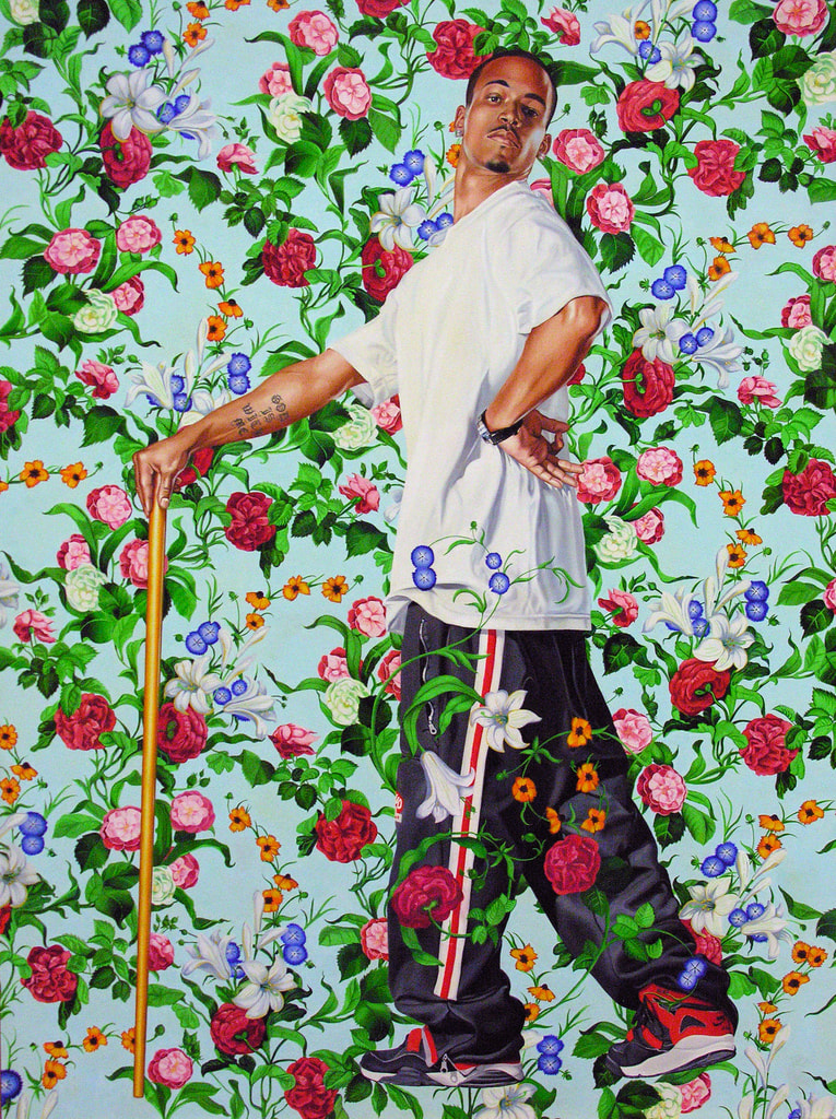 The second piece to examine is La Roi a la Chasse by Kehinde Wiley. This piece was done by Kehinde to mirror Charles I at the hunt, only the subject is an African American male. His posture mimics that of Charles I, one hand rested on his hip and the other on a cane. The hand on his hip is held behind him, and if one looks closely, it almost looks as though he is making the "Ok" sign with his fingers. His posture also seems nonchalant and almost mocking or superior. His head is tilted back, one eyebrow raised and his other features serious. His hair is cut short, and there is a small goatee decorating his chin. He is dressed in his everyday clothes, a white T-shirt and striped athletic pants with red, black and white sneakers. The cane he holds is golden, and on his forearm is a tattoo reading "GOD IS WITH ME". On his other wrist is a watch. The background color behind him is a pale blue color, covered with all different variations of flowers. There are white, blue. pink, magenta, and orange blossoms with twisting stems and leaves. The whole piece is full of vibrancy and color, also making a bold statement in the art community. Kehinde's work can be a source of inspiration for all upcoming artists who are excited about going against the grain and making a difference in our society. Taking a look at both pieces in relation to one another, it is easy to begin spotting similarities between the two. Firstly, let's begin with the obvious. Both paintings depict a man who is powerful. Both men are standing in a similar position, the look of superiority on their expressions. In both pieces, there is a theme of wildlife and nature, greenery carried out throughout both. The pale blue color of the sky in Van Dyck's painting is also carried into Kehinde's piece in the background, creating a correlation with the older artwork. These pieces mimic one another in their exploration of power and prestige, focusing on the characteristics of the men painted. Looking at either piece is intriguing to the viewer, causing him or her to desire to know more about the painted subjects and the meaning the artists had desired to impart. In contrast, it is just as easy and just as important to look at the pieces and find the stark differences that are presented. These differences, perhaps, are most important to what Kehinde was trying to convey through his work. In this observation, we will also begin with the most obvious, touching the core purpose of Wiley's famous paintings. In Van Dyck's piece, the subject is a wealthy, well known, royal European king presented in fancy attire. In contrast, Wiley has chosen to mimic the painting using an not-particularly wealthy or well known African-American male dressed in his everyday clothing. This is a bold statement in the art society, bringing attention to the power and recognition that Kehinde believes the African-American culture deserves. The man in Wiley's piece is not well dressed, does not own a horse, does not have people nearby who serve him, is not royalty, and does not carry a sword at his hip. Rather, as the man's tattoo indicates, God is with him, which is better than any physical weapon. To be frank, this man is not well known and could be considered by society to be a "nobody". Yet, in this piece, he displays a beauty and a power that Kehinde has captured perfectly. His face and posture almost seems to be mocking, as if to say that he deserves to be recognized just as much as Charles I did, if not more. The simplicity of his clothing is refreshing, and he seems to be more comfortable and natural-looking than Charles I in Van Dyck's piece. The background carries the same theme of nature, yet in Kehinde's piece it seems to be more light and refreshing, rather than full of yellow tones and dark shadows. The entire style of each art piece is very different, as can be expected considering the time gap between the creation of each piece, yet each is skillfully executed and incredibly inspiring. As artists, it is important for us to be informed about the history of art in order to recognize how modern artists are building on the ideas of our ancestors. Techniques, ideas, stereotypes, and boundaries are always being redefined, and inspiration often comes through the recognition of other artist's work. After a thorough comparison of Anthony van Dyck's Charles I at the Hunt and Kehinde Wiley's La Roi a la Chasse, one is able to understand the direct correlation between the pieces and explore the deeper meaning behind Wiley's mimicking of Van Dyck. While both pieces hold certain similarities, they also contrast greatly, making the viewer think deeply about their differences. Kehinde has taken one portrait that has been considered the image of power, and made his own rendition using someone who may not typically be viewed as great. By redefining that stereotype, he has inspired countless viewers, myself included, to go out into the world and challenge other boundaries within our society. However, both Anthony van Dyck and Kehinde Wiley have created pieces that are inspiringly beautiful, and it is important to learn everything we can from the work of these artists. Works Cited
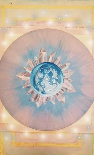
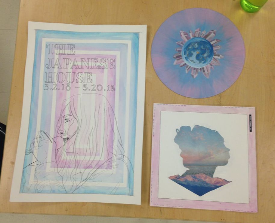
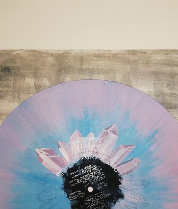
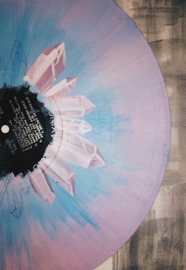
https://www.artble.com/artists/anthony_van_dyck/paintings/charles_i_at_the_hunt https://www.artsy.net/artwork/anthony-van-dyck-charles-i-at-the-hunt http://www.kehindewiley.com/scenic/Le_Roi_a_la_Chasse.html https://blantonmuseum.tumblr.com/post/66114947792/kehinde-wiley-le-roi-%C3%A0-la-chasse-the-king-at-the 11/30/2017 0 Comments Band Design Project ProgressFor the rest of this week, my class has focused on working on our design project for our bands. In my group with Grace, we have been working on a vinyl design and an album cover for Japanese House. Although our plans have stayed similar to what we discussed earlier in the past few weeks, we have made some alterations to the design. For the album cover, Our plan is to use a silhouette photo of Grace as the head of the girl on the front of the album. This photo is pictured below. 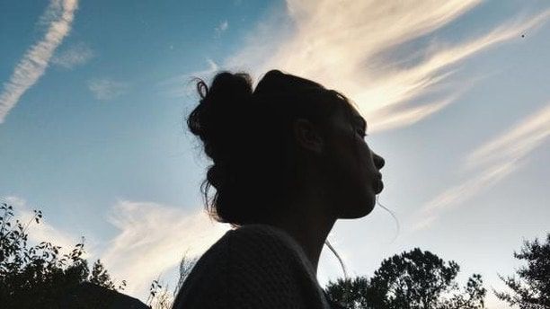 On Tuesday, Grace worked on projecting this image onto the white board and using that projection to then trace the silhouette onto a printed out photo of a sunrise. The silhouette was then cut out along with a photo of a mountain range beneath, and pieced together to create the front of the album cover. Meanwhile, I have been working on painting the vinyl. So far, I have completed the gradient from blue to pink and painted crystals all around the center of the disc. I also plan to paint a full moon in the very middle, which will complete the vinyl. The rest of the design is still being debated, but overall there has been a successful start and we hope that the end result will be satisfactory. Below is pictured the cut out of the silhouette and the mountain ranges, as well as the vinyl in progress. 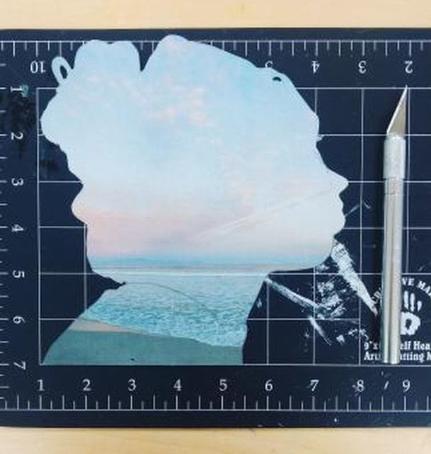
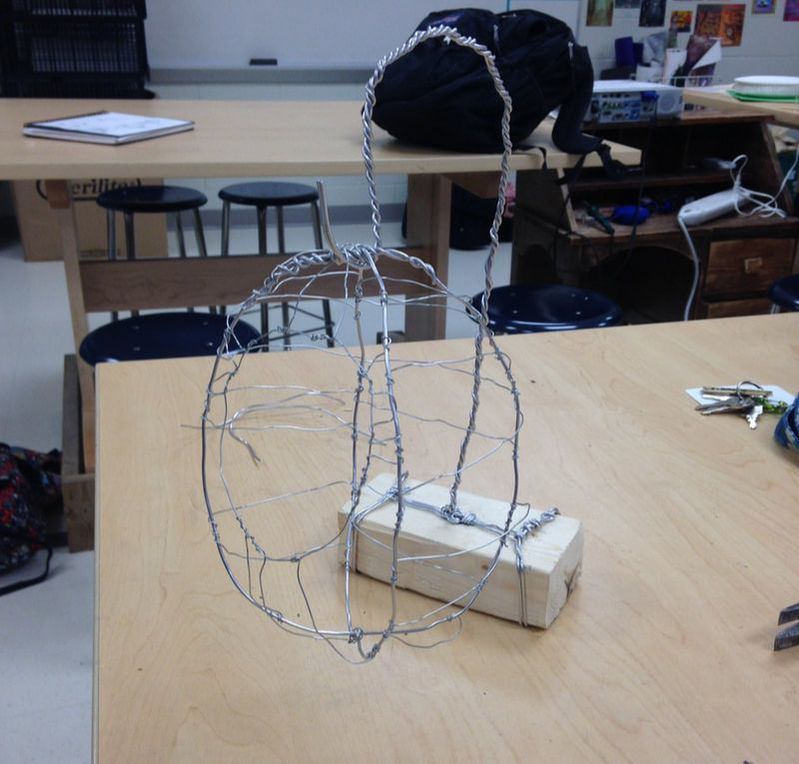
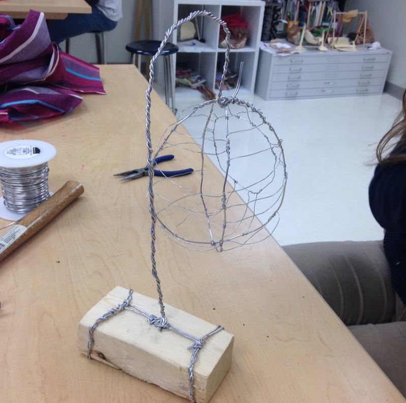
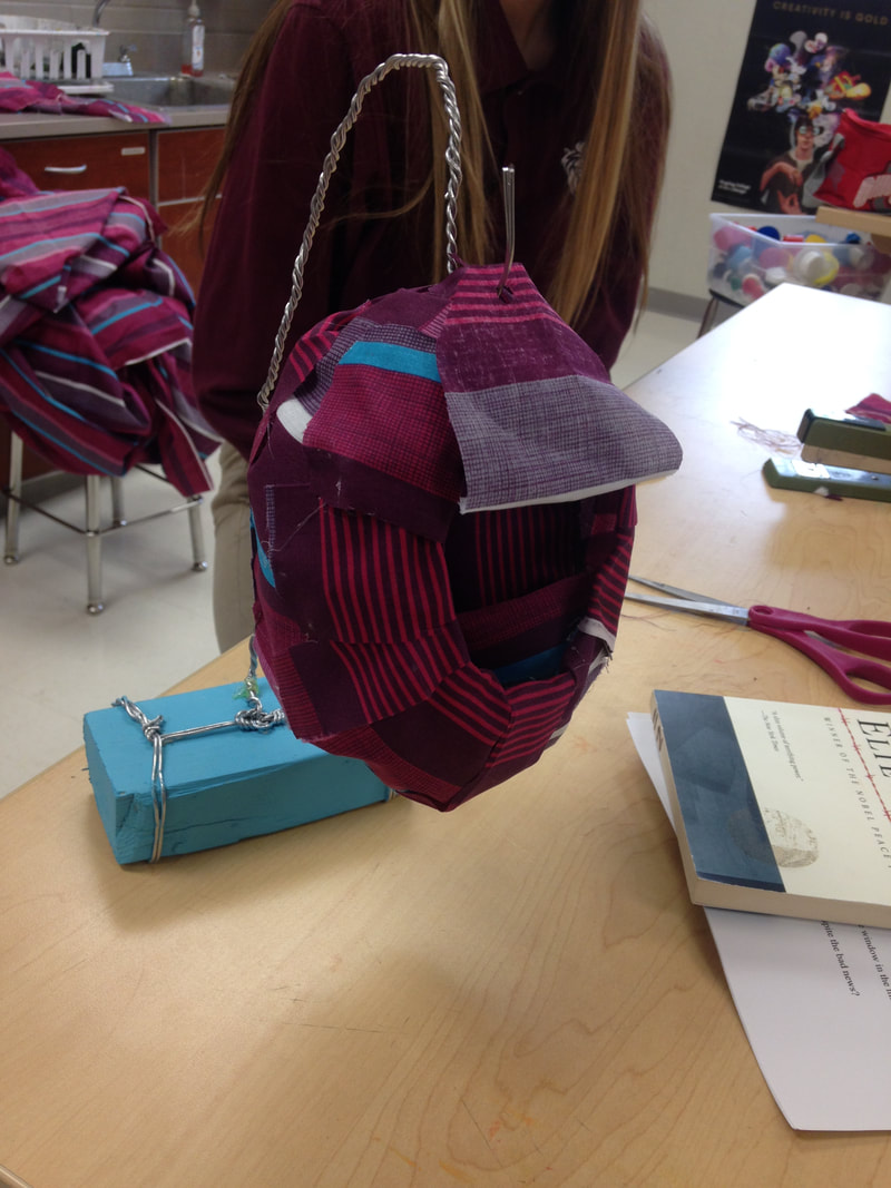
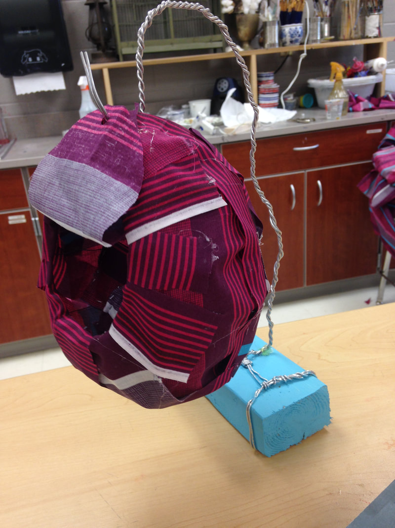
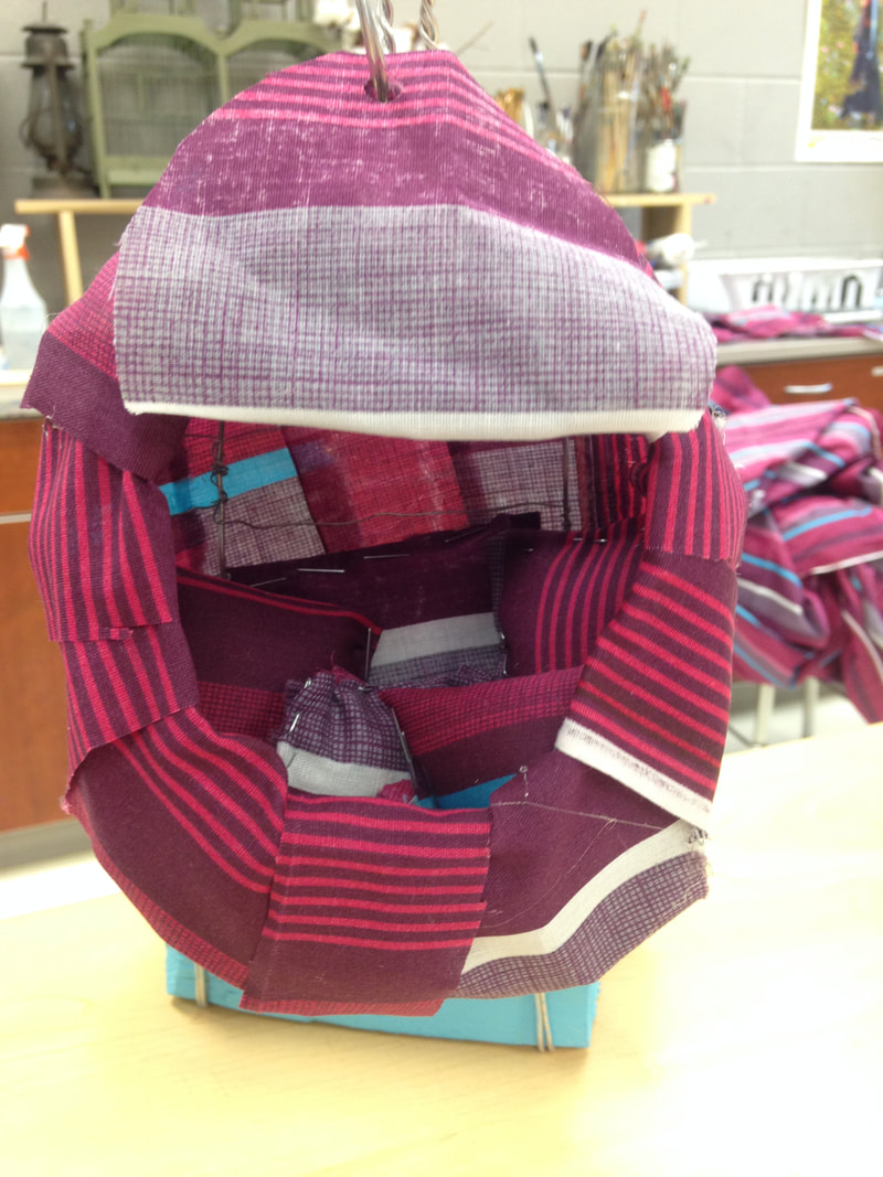
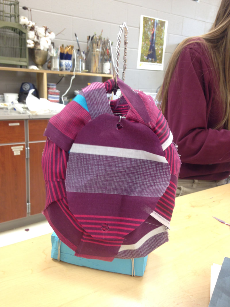
11/30/2017 0 Comments Shoe design Exercise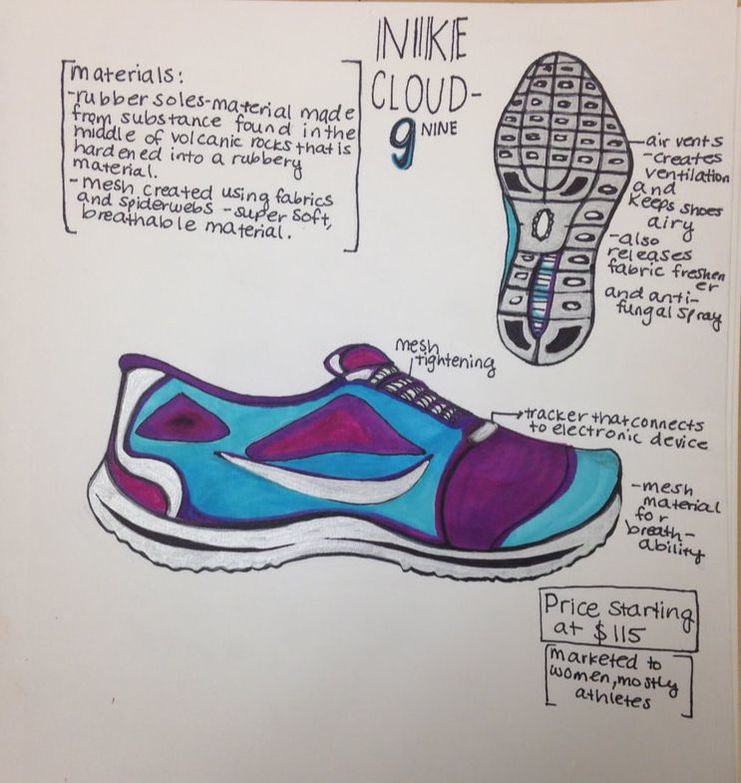 This week in class we did an exercise where we redesigned our own shoes for the next generation. Our objective was to create a shoe that the next generation would wear. I chose to design a running shoe, since I was currently wearing Nike's. Pictured above is the design and the aspects of the shoe that makes it attractive and functional for runners. 11/21/2017 0 Comments Chair Design ExerciseThis week in class we worked on designing and creating a model of a chair. My team, which was Grace, Kayden, and I, took a different approach to the prompt. We still designed a chair, but it was of a different nature than the other chairs. We designed a chair that was almost egg-like, hanging from a wire hook, suspended from the ground. We made the shape of the "cocoon" out of wire, leaving a circular entrance along one of the sides.
-After completing the shape of the egg, we covered the outside in strips of cloth and created a small flap as the door, which can be folded up and over a hook to keep the entrance open. We also painted the wooden stand blue to match the stripes of the fabric and created little pillows and a blanket to go inside the cocoon and make it almost like a little nest. We did have some trouble with the hook and wooden block supporting the weight of the "egg" after we added all of the pillows, but we fixed that problem by hot-gluing the end section of the wire to the wood block. This allowed the wire to be more supportive of the egg. Overall, I am very pleased with how this exercise turned out. We followed an idea and completed it in a relatively short amount of time, overcoming challenges and learning how to successfully design something.
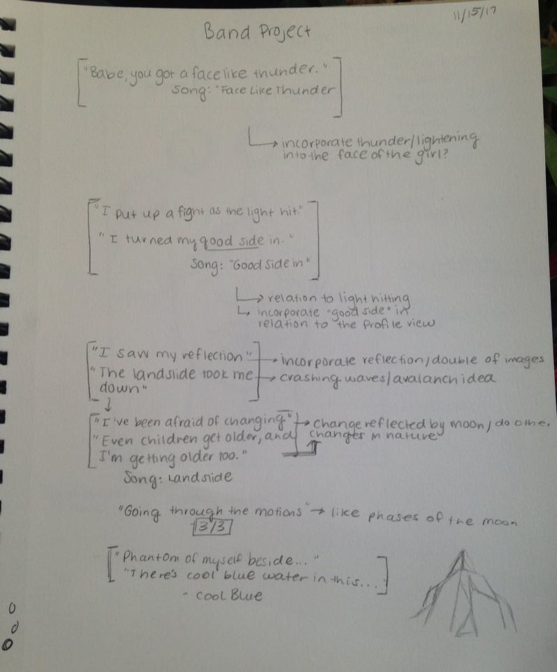
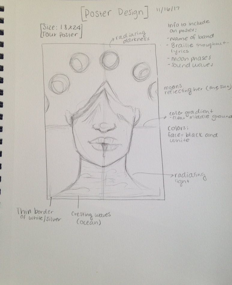
11/18/2017 0 Comments Band Design IdeasThis week, we began designing album covers, posters, and vinyls based on a certain band. I am working in a group with Grace, and we chose to base our project on the band Japanese House. Their music is very melodic, giving the listener both a digital and a natural vibe. This week we simply began by listening to their music extensively, brainstorming ideas, and then making sketches of possible design ideas. So far, we have come up with an idea for almost every piece in the project. Below is pictured some of my ideas based on important lyrics within songs, as well as our idea for the poster we will be creating.
|
Archives
January 2018
Categories |
 RSS Feed
