|
11/13/2017 0 Comments Finished Linoleum Print Making ProjectThis week, I continued working on my linoleum print project. My print was based on Guatemalan textiles. which originated from Mayan Culture. This culture is historically very symbolic. What originally caused me to be attracted to this design was the legend in Mayan culture that the sun and moon are in love, but their love is impossible because they almost never see each other. Their only time together is for a few hours during am eclipse, when, from earth, the moon appears to be covering the sun. This is why, in my design, I put a crescent moon overlapping the sun. The moon is also symbolic in Mayan culture, representing motherhood, fertility, strength, and protection. The chevrons in the background are based on the theme of stripes throughout Guatemalan textiles. After I finished carving into the linoleum and made a sample print using black ink to see what it would look like. Initially I didn't like how thin the sun rays were, so I carved more of the linoleum out to thicken them. Then I began the printing process onto cloth. I debated between using warm colors or cold colors, since I had both the sun an the moon in my print. I decided to have the colors transition from yellow to orange, to red, to purple, to blue. That way both warm and cold colors would be incorporated. Plus, I love gradients. Below is pictured Monday's progress.  On Tuesday in class I continued working on the prints, slowly using more and more purple and blue paint. I was more used to the process at this point, and was able to complete the entire thing relatively quickly. I felt like I was using a lot of paint the whole time, having to continuously add more so that it wouldn't get too dry. It also bothered me that I always had to make a print on the edge of the cloth, some of it getting onto the table. This seemed unnecessarily messy, but now that it is finished, I really like how it looks. Overall, I am very pleased with the end result and I think that the gradient tones I achieved with the paint turned out well. Below is pictured the final piece.  
0 Comments
11/9/2017 0 Comments Linoleum Printmaking Progress Today in class I began carving my linoleum print. Using the smallest tool available, I carved out the design inspired by Guatemalan textiles. Carving into the block was actually a lot less difficult than I expected. I just had to take it slow, getting small areas and details perfected. This process was actually very soothing and satisfying to me, and I loved working on this print. It is inspired by Guatemala, their culture full of rich symbolism and beauty. My next step is to use the block to make prints onto fabric. I would love to try multiple different colors with the prints, including possible yellow or orange since the focus of the piece is the sun intermingled with the moon.
11/8/2017 0 Comments Finished Dressmaking ProjectThis week, we were given three days to finish our dressmaking. Our group decided to only make the skirt and the belt on the skirt. On Monday, only Kayden and I were in class, so we focused on cutting out strips of magazines and attaching them to the wire waistband of the skirt. Kayden worked on cutting out the strips, and I aligned them and glued them together to create longer pieces. I was intentional about organizing the colors of the strips, starting with a dark color and then slowly using lighter pieces to create a gradient. The photos I used for the pieces included two very contrasting themes, including pop culture, fashion, nature, and snowy mountain ranges. This gave the skirt a very earthy, fairy-like feel, the whole thing seeming very delicate and flowing. I made the first few pieces shorter, and slowly increased the length of the strips so that the skirt would fall in high-low style. Below is pictured our process in making the strips, as well as some of them laid out before being attached to the skirt.   After creating the rest of the skirt and layering the magazines so that the space between the strips was filled, we glued on the belt that Grace and Kayden had made, which was covered in small paper roses. It truly added so much to the skirt, and overall I am very happy with how the whole piece turned out. However, it was not without some difficulty here and here. It was rather time consuming to make all of the magazine strips, and at times it was difficult to find the colors I needed to make the gradient, but I learned a lot more about patience about designing through this. I was initially worried about the skirt blowing and being too revealing when our model, Kayden, walked. But after layering the strips, it provided enough coverage for it to be acceptable. Overall, I believe that our skirt turned out very well, and I am encouraged by how well our team worked together to design an article of clothing.  
 11/3/2017 0 Comments Fashion Design Exercise Progress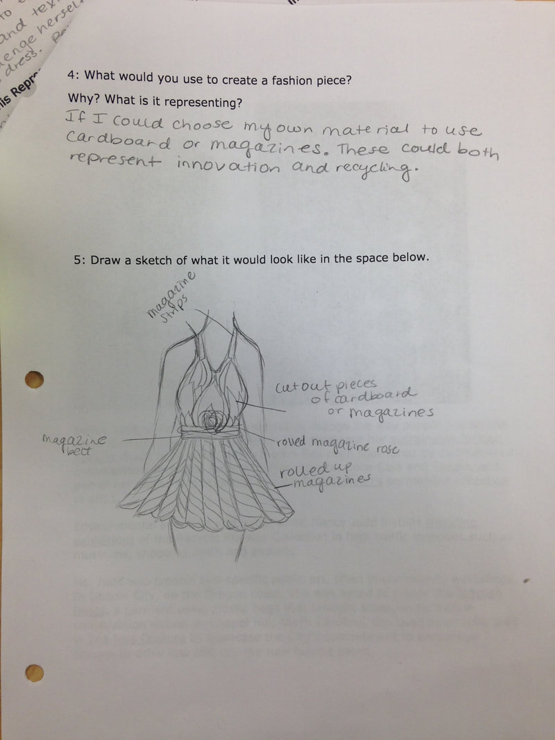 Today in class, we studied Nancy Judd's Bicycle Tubing Dress and spent time looking at other examples of her kind of work. Then, we were instructed to draw our own design that could be made using only magazines. Above is pictured the design I came up with. Ideally, my idea would incorporate cardboard as well, but all of the ideas can be managed with only magazines. Next, we all split up into groups and began working on our design, collaborating all of our ideas. My group includes myself, Kayden, and Grace, and we are working on creating a dress. 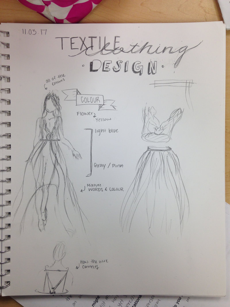 Above is pictured how my group plans to design the dress using wire and magazine strips. The skirt is to be long and flowing, including a gradient from blue to a darker gray or black. The top will also include blues, yellows, and pinks. Today in class, we were able to start on the skirt, sizing it to be worn by Kayden. We want to complete that first in case we don't have time to do the top of the dress. We used wire to create the waist of the dress, creating a small latch in the back in order to take it on and off. Then we began cutting strips of magazine and attaching them to begin creating the skirt. On Monday, our goal is to complete the skirt and hopefully begin on the top of the dress. 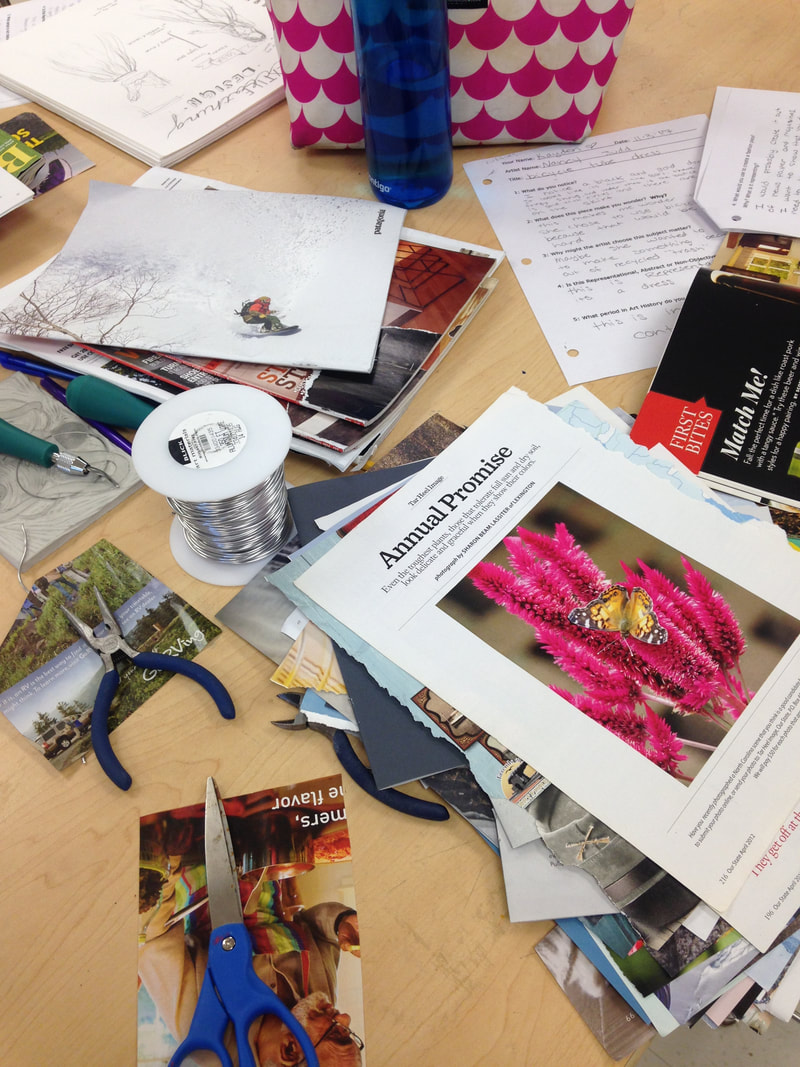 11/3/2017 0 Comments Linoleum Print Progress This week we worked on the Linoleum printmaking project. Above are pictured my design ideas, which are based off of Guatemalan textiles. I simply drew out three different patterns that I would be interested in exploring. I liked all of them, but ultimately I chose the pattern with the sun in the center because of the aesthetically pleasing aspect of this design. I darkened it with a B pencil before transferring it onto my linoleum block. The first time I tried to transfer it, I got distracted with talking to someone before rubbing the scissors against the back of the page to transfer the image. As a result, the transfer turned out crooked. So I flipped the block over and tried again on the other side. It was still slightly crooked, but rather than redoing it, I simply trimmed the linoleum to fit the transfer.  Above to the right is pictured my final transfer onto the linoleum. I decided to draw the shape of a crescent moon within the sun, and to add a vertical line behind the sun to help with the symmetry of the whole thing. My next step is to begin carving into the printing block. But first, I must complete my practice block, which is on the left. I am working on copying my design onto that block, and then I will practice carving so that when I do the real print, I will feel more comfortable working with it and will make fewer mistakes.
10/31/2017 0 Comments Skeleton Dance Warm Up Sketch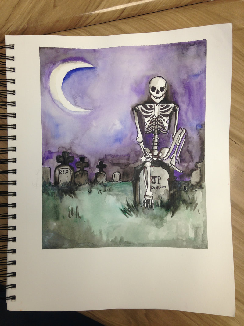 Today in class, since it is Halloween, we watched Disney's cartoon titled "Skeleton Dance." I loved this video, as it put an almost comical theme to Halloween and made everyone laugh. Using my inspiration from that video, I think created a composition based on it. I wanted to create a piece that both reflected the video ad gave the viewer the creepy feeling of Halloween. Knowing that I was planning on using watercolor, I taped around the corners of my piece and then sketched out the image of the skeleton sitting casually on top of his grave, one leg propped up nonchalantly. There is a smile on his face, but the scene around him is dark. There is long, dark grass around the graves, and the sky is dark purple with the moon illuminating the area below. Although I am mostly pleased with how this piece turned out, I wish that my use of the watercolor had been more skillful. There are areas of the sky that did not blend well, and the color in the grass faded drastically as the paint dried. I had been using an Aqua-Brush pen with the watercolor, and there never seemed to be enough moisture so I had to keep squeezing water out of it. Although the Aqua-Brushes are usually my favorite to use, it may have been best for me to use a normal paintbrush and water this time. Overall, I thoroughly enjoyed doing this piece, which was completed in about an hour, and it inspired me to perhaps create more pieces that have a spooky theme.
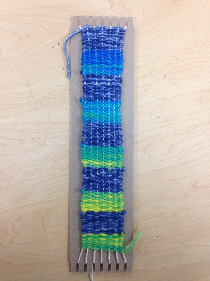
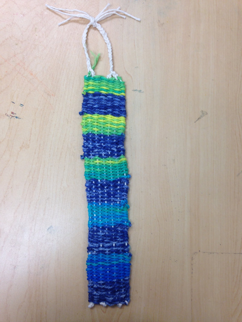
10/31/2017 0 Comments Finished Weaving Exercise
Yesterday in class, we learned about weaving. We began and completed a weaving exercise using various yarns. For my project, I chose to alternate between a darker blue yarn and a yarn that blends between blue, green, and yellow. I am very pleased with how it turned out, the color of the teal yarn slowly changing to green and yellow. At first it was slightly difficult for me to pick up on the weaving, but once it was explained I found that it was very simple and relaxing. The action of it is very calming, and I loved learning how to create art using weaving.
10/25/2017 0 Comments Finished Embroidery Exercise
 This week in class we learned about embroidery. This was my first real experience with embroidery, although I have done cross stitching and other sewing before. For my embroidery exercise, I decided to do something simple and cute. I chose to do a tiny hot air balloon floating through the sky, clouds and sunshine peeking around it an little pennant flags fluttering behind. I love hot air balloons, so this was very enjoyable for me. I decide to use more pastel colors, dividing the folds of the balloon into 7 sections and creating a design in each section. Then, I used those colors throughout the rest of the project. I also added a little green strip as the ground below the balloon, and blue and pink thread bordering the piece. The whole thing reminds me of something that would be a decoration in a baby's room, but overall I am very pleased with how it turned out. There were moments when I wished I had chosen to do something more intricate or detailed, but in the end I think I enjoyed the simplicity of my subject choice.
10/25/2017 0 Comments Finished Collograph Print Above is pictured my finished Collograph. I chose to do a leaf because of the intricacy of it and the detailed print I knew it would make. I used four layers of the thin cardboard paper to create all of the details of the veins and the stem. Then I created a small border alone the bottom right corner to frame the image of the leaf and give it some sort of context. My next step was to use the Collograph to make a print. 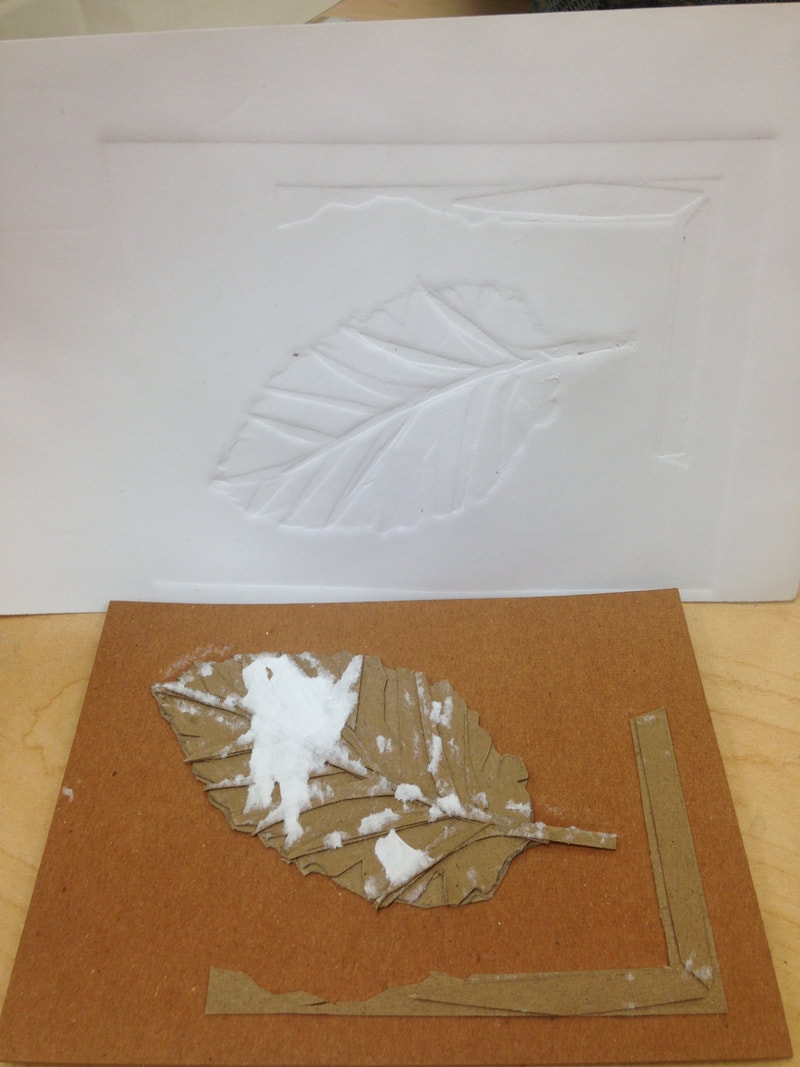 Since there was some dry glue on the top of my Collograph, when I tried to make the first few prints, lots of the paper ripped off and remained stuck onto the Collograph. So, I had to make several prints before there was no longer any glue expose to rip the paper of my prints. On my fourth print, the paper remained completely intact and created a very nice print onto the damp paper. I am very pleased with how it turned out. I would enjoy making several more of these prints and using watercolor or some other medium to highlight the details of the indention.  10/25/2017 0 Comments Finished Illustration Exercise  This week I completed my illustration exercise, based on the story of Snow White an Red Rose. After completing the inking process of the piece, I used watercolor to add color and depth to the photo. This part was my favorite, because finally I was able to see it come alive on the page. I did the green grass first. fading areas of it into blue and brown around the trees further away, and then went back into with the purple, indigo, and red for the flowers. The other areas of the piece were very enjoyable to add watercolor to, and I think it made the illustration much more appealing. Illustration is something I have not done a lot of, but I thoroughly enjoyed it and how it allowed me to put the words of the story into a visual image. I hope to explore this concept more thoroughly in order to see if it may be something I am interested in pursuing.
|
Archives
January 2018
Categories |


 RSS Feed
