|
5/23/2018 0 Comments Finished Final Project
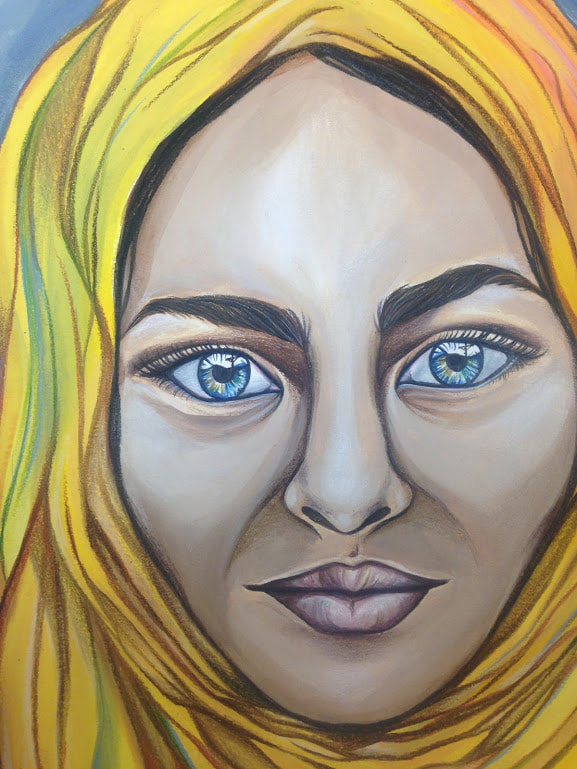
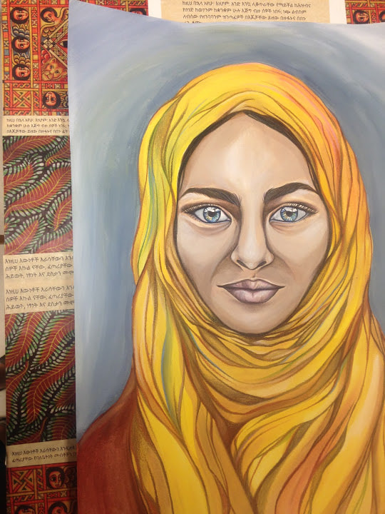
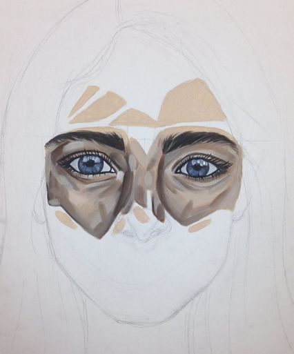
For this piece I used a technique that I had never really tried before, inspired by work done by Stephanie Ledoux. First, I painted a portrait of a refugee from Ethiopia, now living in Atlanta, on watercolor paper. I used watercolor as the base layer of her skin before using watered-down acrylic paint to complete it, and colored pencil to fill in the eyes. I also used colored pencil over the acrylic paint once it had dried, adding shading and dimension to her face. After that, I printed out Ethiopian textiles and Scripture in the Amharic language onto parchment paper and modge-podged it onto a large canvas. Then I attached the portrait onto the canvas, framed by the textiles and collaged paper around it.
This piece is meant to express the beauty and the power of this woman’s culture. It is almost a contrast to one of my earlier pieces, “Silenced”, where the woman in the picture looks shy closed off. The woman in this piece is bold, her face open and the colors of her hijab bright. There is also a small part of this piece that I intentionally hid within her face. It is such a small part, yet it encompasses my entire message as an artist. Within the woman’s eyes can be seen a reflection of the cross, revealing the event that ultimately brings this woman, and all people, true peace and validation. The meaning and purpose she has received through the sacrifice of Jesus has become a part of her, changing her life to be full of truth and joy.
0 Comments
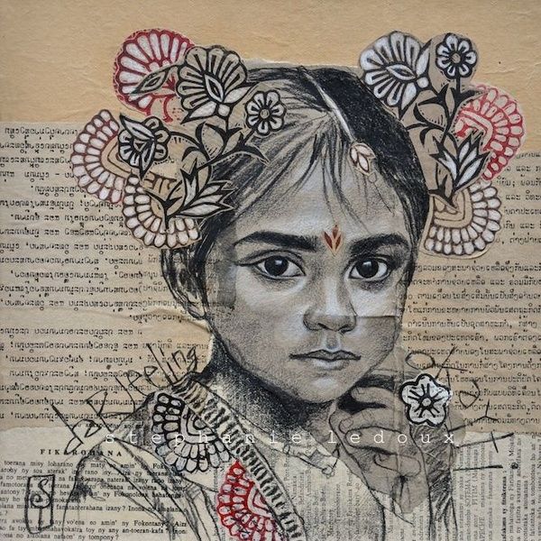
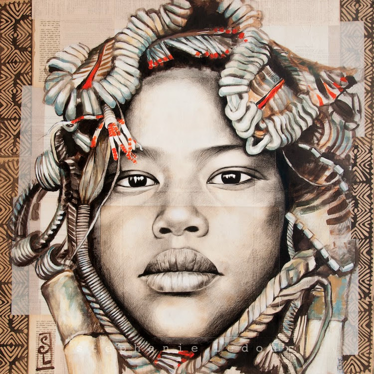
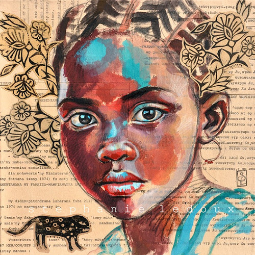
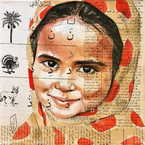
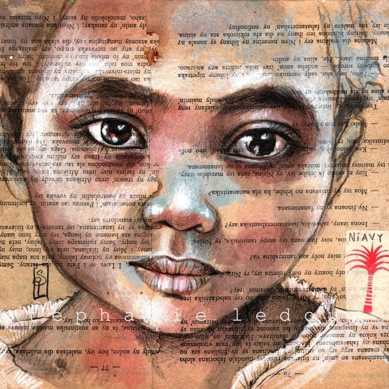
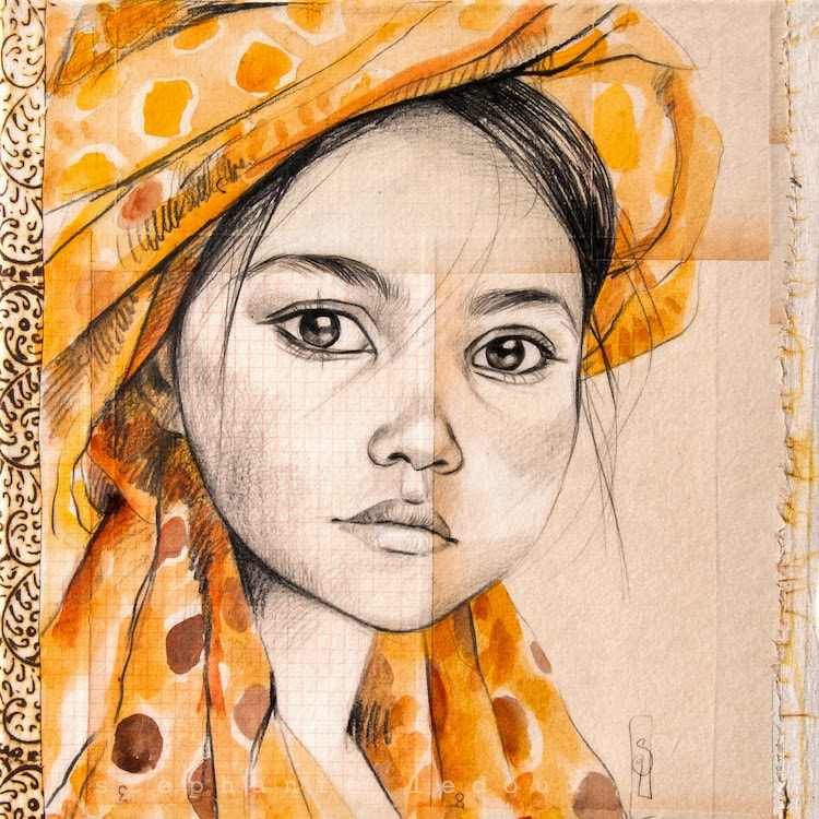
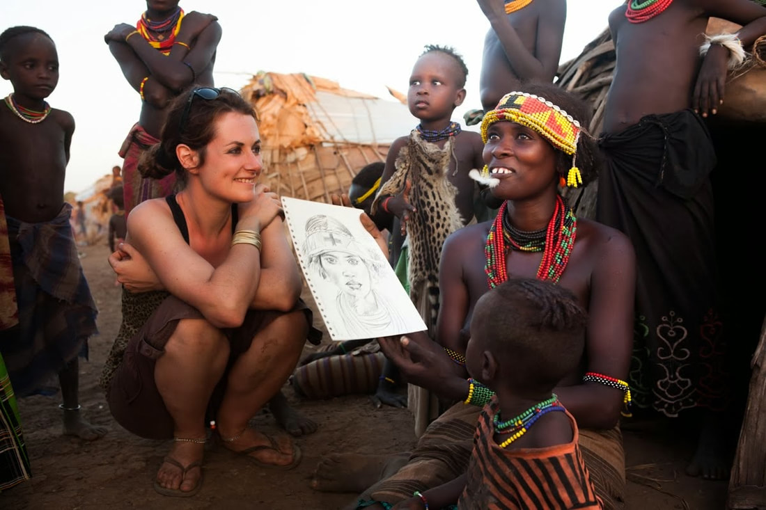 As my inspiration for my final project, I chose to research European artist Stephanie Ledoux. Stephanie mainly focuses her art around portraits, painting beautiful pieces of the people she meets during her travels. She divides her time between traveling and creating images in her sketch book and then using those sketches to paint more detailed pieces during her studio time. These paintings are often representations of her experiences with the people and places she visits. Often when she is sketching, throngs of people gather to watch, only energizing and encouraging her more. While drawing, she interviews her models t learn about their lives, traditions, and aspirations and then enjoying their reactions when she shows them the drawing. She has enjoyed her status as a woman, allowing her to gain access into homes and talk with women, allowing her to build relationships with the people she meets. To her, drawing is a universal mode of expression, transcending the language barriers she often faces.
I chose to research Stephanie because her work celebrates the beauty of diversity, keeping alive their culture and traditions. Each portrait tells a story, both about that person and about Stephanie's experience. I am also very drawn to Stephanie's technique of using watercolor over paper and maps, incorporating collage into her paintings. I also love how in some of her pieces she uses graphite and acrylic to paint the colorful portraits. I think her style correlates well with the direction I want my artwork to go, and I could honestly spend hours looking at her work! For my project, I am hoping to use either watercolor with watered down acrylic on top of paper mounted on canvas, or I could use spray paint an acrylic on canvas. However, I would like to incorporate layered paper or collage in my own piece. As for sizing- I would am planning on working on a 24x30 canvas. As they say, GO BIG OR GO HOME! (: 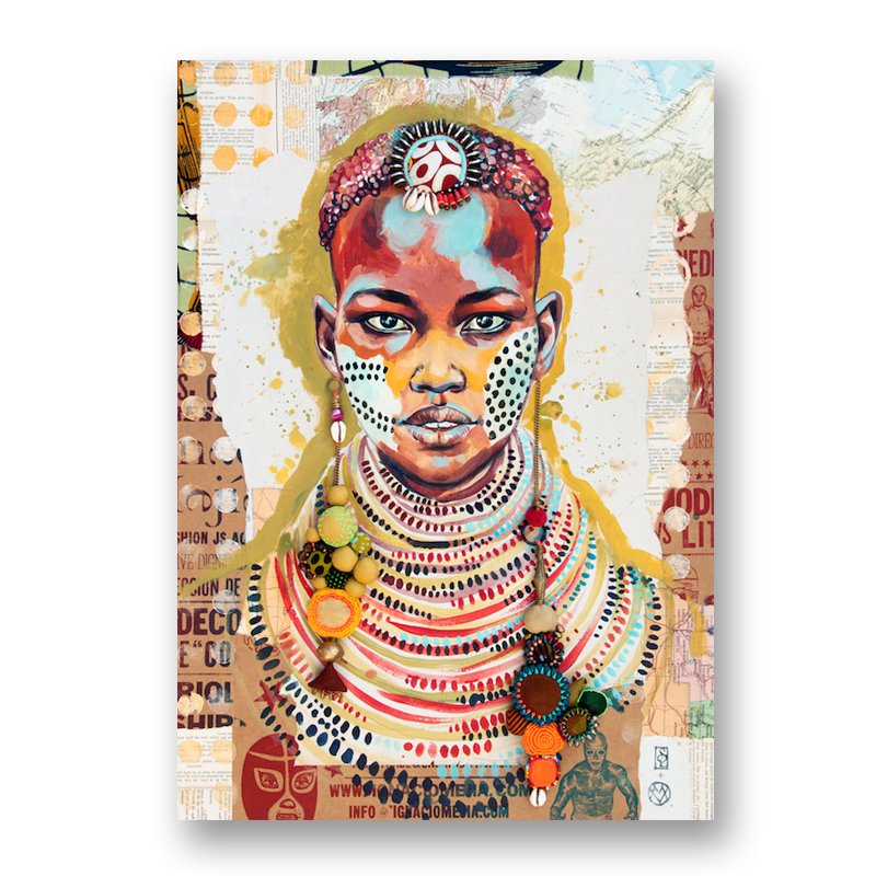 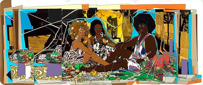 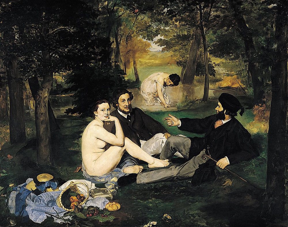 Mickalene Thomas is a well-known artist in Brooklyn who expresses the ideas of black female beauty, sexual identity, and feminine power through elaborate, collage-inspired paintings that are decorated with rhinestones, enamel, and colorful paint. She uses ideas from historical artwork in her pieces, borrowing from artists like Gustave Courbet, Romare Bearden, David Hockney, Edouard Manet, and Henri Matisse. Thomas was born in New Jersey in 1971 and studied Pre Law and Theatre Arts in college in Portland, Oregon. She then received her BFA from Pratt Institute and her MFA from Yale University. One of her most famous pieces is called “Le Dejeuner”, in which she creates a contrast with work done by Eduardo Manet.
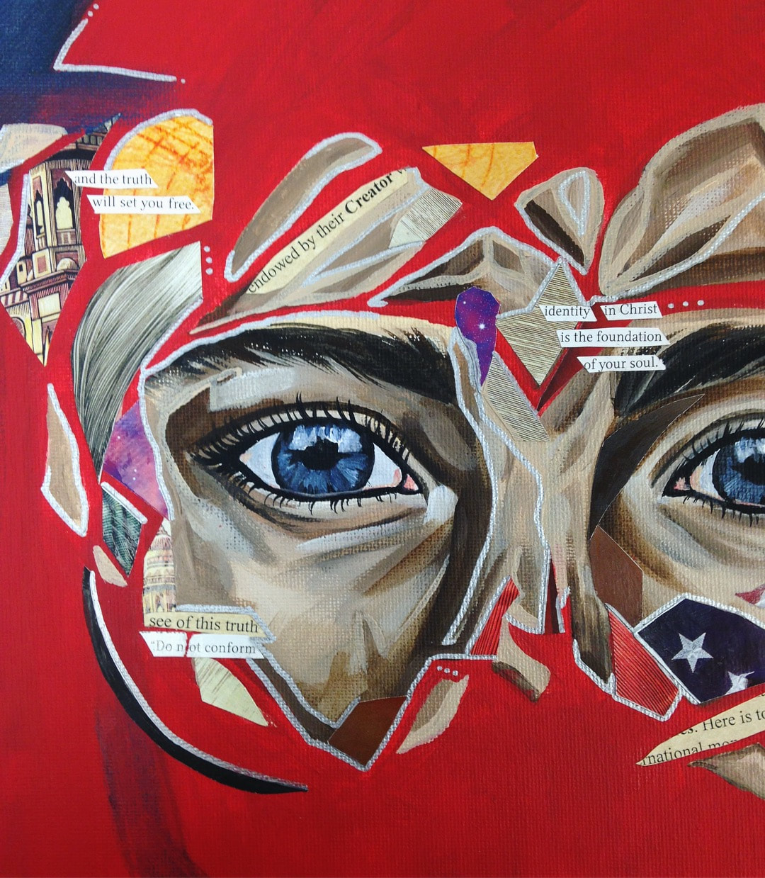
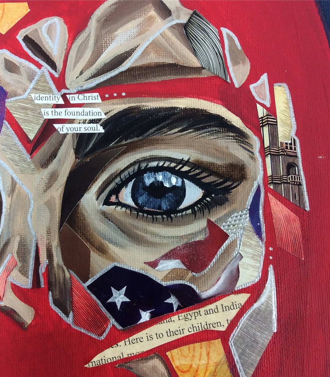
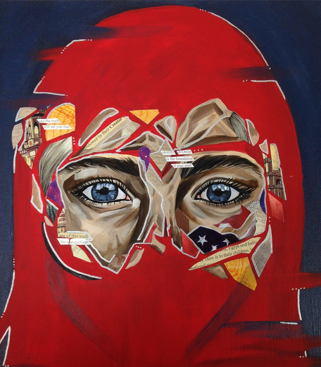
Eduardo Manet was a French artist born in Paris in January 1832. He became one of the first artists of that time to paint modern life. This hugely impacted the transition from Realism to Impressionism, and the controversial aspect of his work is still impacting the world of modern art to this day. In 1841, he enrolled in a secondary school called the College Rollin. Manet was also influenced by his travels to Germany, Italy, and the Netherlands, meeting artists who would help shape his career. His famous piece, “Dejeuner Sur l’Herbe” is the work that Mickalene Thomas based “Le Dejeuner” off of. In order to understand the relationship that the two pieces have to one another, first we must look at them both individually. Mickalene Thomas’ “Le Dejeuner” is full of bold colors and intricate patterns. There are three African American women seated together as if they are lounging or relaxing, eating lunch together as intimate friends. All three of the women seem to have a colorful style, correlating with their culture. Their hair is styled in accordance with their culture and their make up is bold and beautiful. The whole piece shouts expression, color, and a unique power. Two of the women seem to have a darker skin tone, while the woman on the far left has a more amber complection. The background of the piece more of an abstract form, yellow and oranges contrasting with the blues and greens toward the bottom of the piece. The entire piece looks almost like it is fragmented glass, different cracks breaking off pieces of the painting. The surface of the painting looks almost glasslike due to the resin covering, giving the piece a shiny, modern appearance. The style of the work has a pop-art feel to it, the bright colors drawing the viewer’s eyes around the work and causing him or her to begin searching for deeper meanings within Thomas’ painting. Eduardo Manet’s painting, “Dejeuner Sur l’Herbe,” is a large oil painting on canvas. In the painting, there are four figures. Two men and one woman are seated around their lunch in the forest while another woman is behind them slightly in the distance, bent over toward the ground. The two men seem to be of wealth and importance, dressed in black robe and a brown suit with nice pants and a relaxed appearance. One is reclining while the other is sitting propped up with his hand, a faint smirk playing on his mouth. The woman beside them is, in contrast, fully nude, her clothing having fallen away from her body. Only part of her garments are wrapped around one of her legs and placed beneath her so that she is able to sit on the grass. The man next to her appears to be sitting close to her with almost a possessive air. She is the only one in the painting looking directly at the viewer. The woman in the background appears to be wearing a thin dress or her bathing clothes. This aspect of the painting causes the viewer to wonder why the men are fully clothed, but the women are nude or scantily dressed. Was this the womens’ choice? Are they forced to be less dressed or nude as a means of entertainment and visual pleasure for the men in their state of relaxation? Looking at this painting, the eyes of the nude woman catch the attention of the viewer. She looks directly at the viewer, and although a faint smile plays on her lips, I wonder if there is something more there: An unspoken discomfort? An expression begging for someone to revive her dignity and stop this objectification? Perhaps her feelings only continue to be stifled by the society of that time… until modern artists begin voicing these unheard opinions. Analysis of Thomas’ “Le Dejeuner” and Manet’s “Dejeuner Sur l’Herbe” reveals that these pieces contain clear similarities. Firstly, the three women in Thomas’ piece clearly mimic the postures of the group in Manet’s painting. Both are relaxed, appearing to enjoy the simplicity of companionship over lunch. It is also interesting to notice that the skin color of the women in the first painting directly correlates with the coat colors and skin color of the group in Manet’s painting. The complection of the woman on the far right is similar to the color of the coat of the man on the right. The woman in the middle has a complection similar to the coat color of the man in the middle. And finally, the amber color of the woman on the far left is the lightest, in relation to the woman on the left in Manet’s piece. The colors of both pieces are also very similar. Both incorporate lots of greens, oranges, and blues. Thomas also incorporates abstract tree-like structures in the background in order to parallel the forest setting of Manet’s piece. Despite the obvious similarities between the two pieces, the differences are almost even more apparent. Firstly, the most obvious difference is the difference in skin color between the people in Thomas’ painting and those in Manet’s piece. While Manet painted four wealthy, caucasian men and women, Thomas painted three African American women. These cultures contrast, only more accentuating the differences in style between the two paintings. While Thomas explored more of a pop art style, including bright colors and abstract designs, Manet’s style was much more detailed and realistic. While both pieces express a form of power and culture, their meanings are quite different. Manet’s piece holds the connotation of male dominance and the wealth of caucasian people during that time, while Thomas accentuates the power, dignity, self-reliance, and beauty of African American women. Overall, both pieces are powerful and interesting. The relationship between the two paintings are clear, and the message of Mickalene Thomas through her work is clear. It is inspiring to see how modern artists are exploring the ideas of those from the past, while challenging societal ideas and expressing the truth of the power and beauty of those who were once considered as less. The voices of each painting are uniquely different from each other, yet explore similar ideas in different ways. The work of Thomas reminds me of Kehinde Wiley's mission through his artwork. Both artists inspire me to think about what I am expressing in my own work, motivating me to pursue my own passions and challenge the way our society thinks. 5/3/2018 0 Comments Finished Truth To Power PieceThis week we finished up our Truth to Power pieces. This process was interesting for me because I had originally started one idea for this project, but after working on it for a day or so, I simply wasn't feeling inspired. I didn't feel connected to the piece and I had some other ideas about how I wanted to express the truth of my identity. After researching artist Patrick Bremer, I felt inspired by his work an wanted to try his style of collage, something I have not worked with very much. This entire piece is slightly outside f what I would normally do, and I experimented with a variety of techniques and ideas in this piece. I began by painting the face, the silhouette, and the background with acrylic paint. Then I used images and text from magazines and other sources to create a collage over the skin. My meaning behind this piece is simple. As I thought about the idea of truth and power, I struggled with the idea that each person has his or her own definition of truth. Looking at it this way, that means truth can be defined about 7.3 billion different ways. In that case, is there any such thing as truth in the first place? This goes back to the idea that the experiences of each individual person ultimately shapes their worldview. So I decided to create my piece based on what I have seen to be true in my own life. All that I could think about when I was asked to express truth is the power of God and the impact my faith has had on my life. The power of God, who created the earth and has all things within His control, is the most incredible truth I have experienced. Instead of grasping around for some fleeting way to add meaning and substance to my life, my “identity in Christ is the foundation of my soul”, and in Him I find truth because I know that His sacrifice, the shedding His blood, and his victory over death is the reason I can live free. I wanted to show this through my piece, so I added some symbolism. The red color of the silhouette represents the blood of Jesus, intertwined and essentially making up my existence. The pieces of images and text represent my experiences and what makes up my identity. And the shifted brushstrokes in the bottom represent my openness to the ideas and opinions of others, as well as my own output of thoughts and my witness of the truth and power of Jesus in my life.
|
AuthorWrite something about yourself. No need to be fancy, just an overview. Archives
May 2018
Categories |
 RSS Feed
